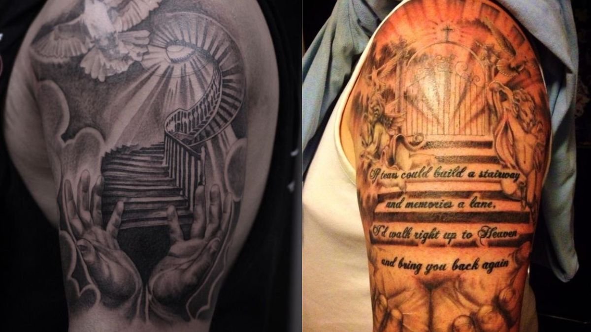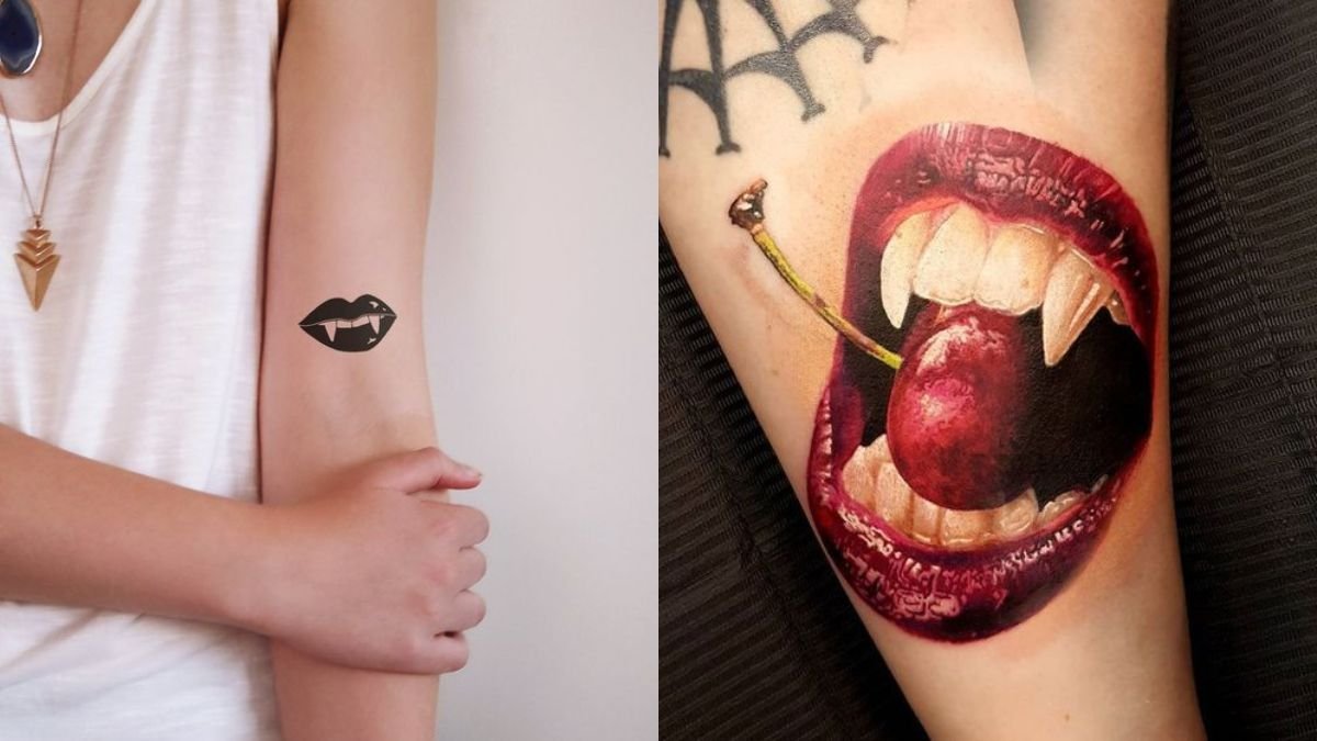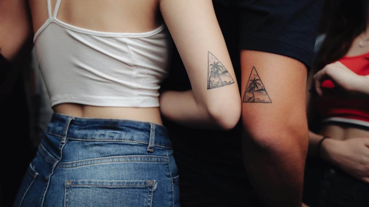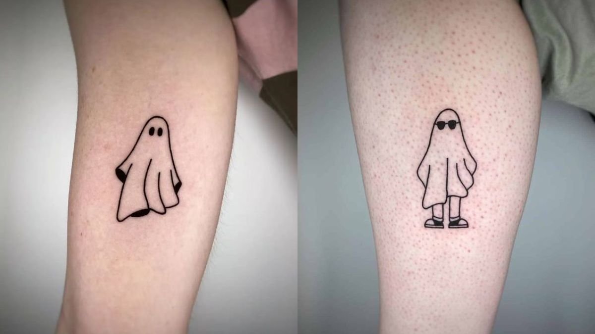

Here is the thing worth deciding before you book anything: the best Thanksgiving tattoos are not really about Thanksgiving.
They are about what sits underneath it. Harvest, abundance, autumn, gratitude, family, food. Those are the themes that still make sense on your arm in twenty years, and they are what artists mean when they say the challenge is moving past the obvious roasted turkey to find the deeper symbols of the season.
A cornucopia or a wheat sheaf reads as a considered piece for the rest of your life. A cartoon turkey in a Pilgrim hat reads as a joke you stopped finding funny some time around your thirties.
So this list runs from the imagery that ages best to the imagery that is most explicitly about the holiday itself. All of it is legitimate. Just know which end you are choosing from.
What to Avoid, and Why
This needs saying plainly and briefly, because it is permanent.
Skip cartoon Pilgrims, generic Native American figures, headdresses, and any version of a “first Thanksgiving” scene. This is not a fringe opinion. Tattoo publications state it directly: designs featuring cartoonish Pilgrims, simplistic Native American figures, or anything that trivialises the colonial experience should be avoided entirely.
Two reasons, and both matter. The historical narrative those images depict is not accurate, and Thanksgiving’s history is genuinely contested, with many Native Americans observing the day very differently. And appropriative Native imagery is a well-known problem in tattooing specifically, which means a lot of artists will decline the work anyway.
The recommended approach in the trade is the one this article is built on: focus on the season and the natural world rather than on historical narrative. That is not a restriction. It is where all the good designs are.
Harvest and Abundance
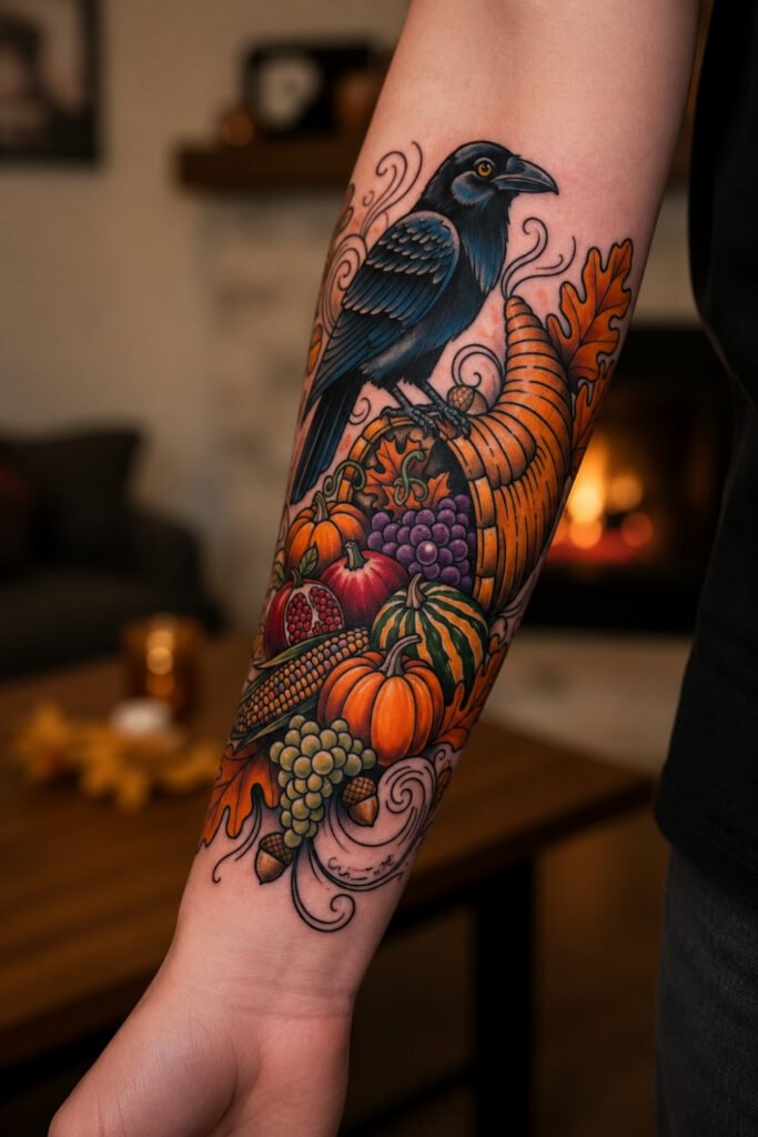
1. The Cornucopia
The horn of plenty, overflowing with gourds, squash, grapes and pumpkins.
Probably the most potent symbolic image available here, representing boundless abundance and sustenance, and it predates the American holiday by a considerable margin. It works in traditional, realistic or illustrative styles.
Best as a forearm or shoulder piece where the composition can follow the curve of the arm.
 Save
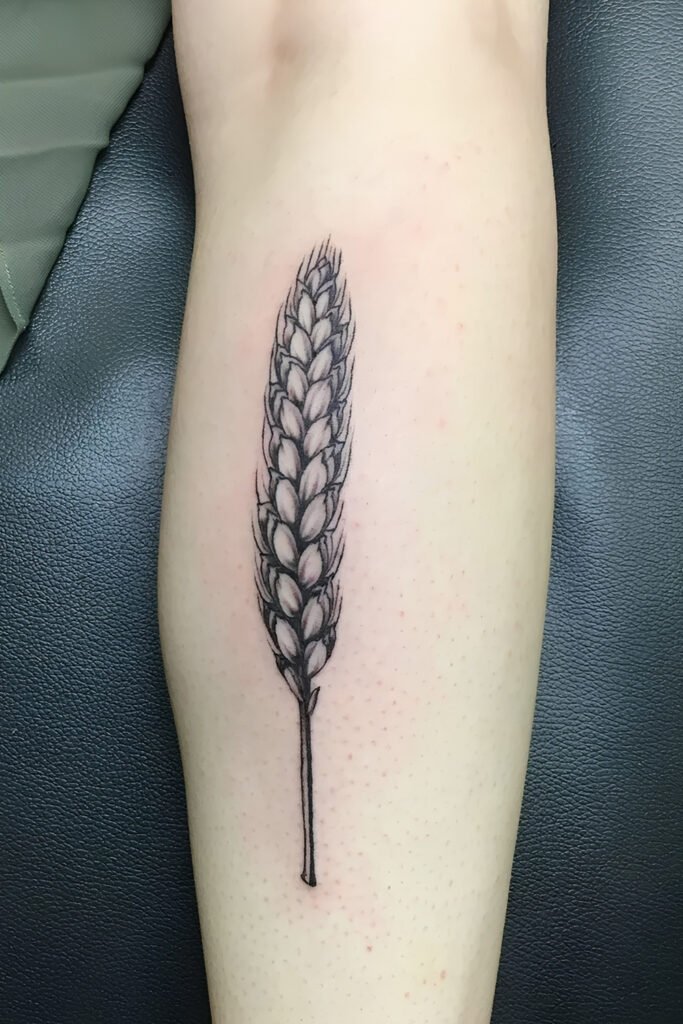
Save2. Wheat and Grain
A sheaf of wheat, single stalks, or grain worked into a larger composition.
The most understated harvest image and the one that ages best of anything on this list. Wheat has meant harvest, sustenance and cycles for thousands of years, and it reads as agricultural or classical rather than as seasonal decoration.
Particularly good in fine blackwork along the inner forearm or the ribs.
 Save
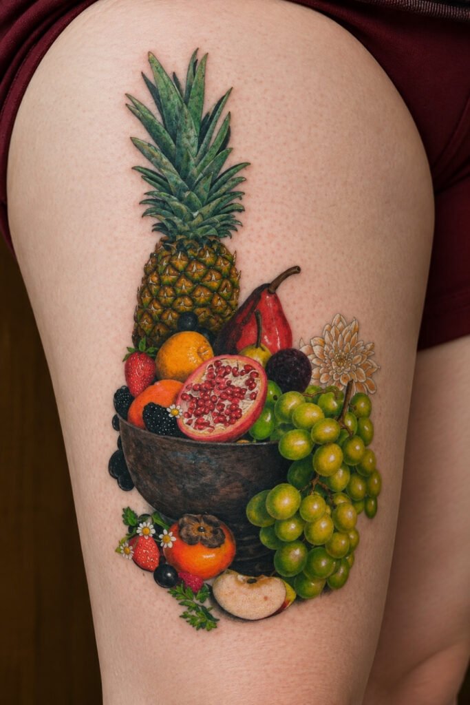
Save3. The Harvest Still Life
A composed arrangement of produce, rendered like a Dutch still life: squash, apples, grapes, bread.
More ambitious than a single motif and considerably more interesting. Painterly styles suit a broad canvas, so a thigh, a calf or the back gives an artist room to work.
If you want colour anywhere in this article, this is where it earns its place.
 Save
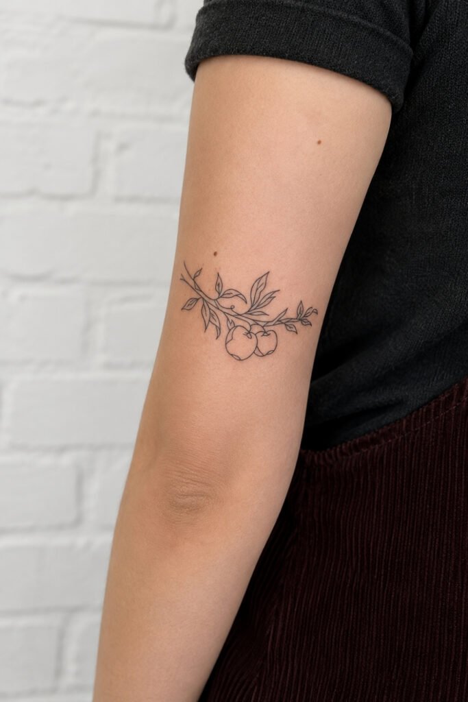
Save4. Apples and Orchards
An apple branch, a single fruit, or an orchard scene.
Quieter than a cornucopia and easier to place small. Apples carry a lot of meaning without needing explanation, and the shape works at almost any scale.
A good first tattoo, since it is simple enough to age well and small enough not to dominate.
 Save
SaveAutumn
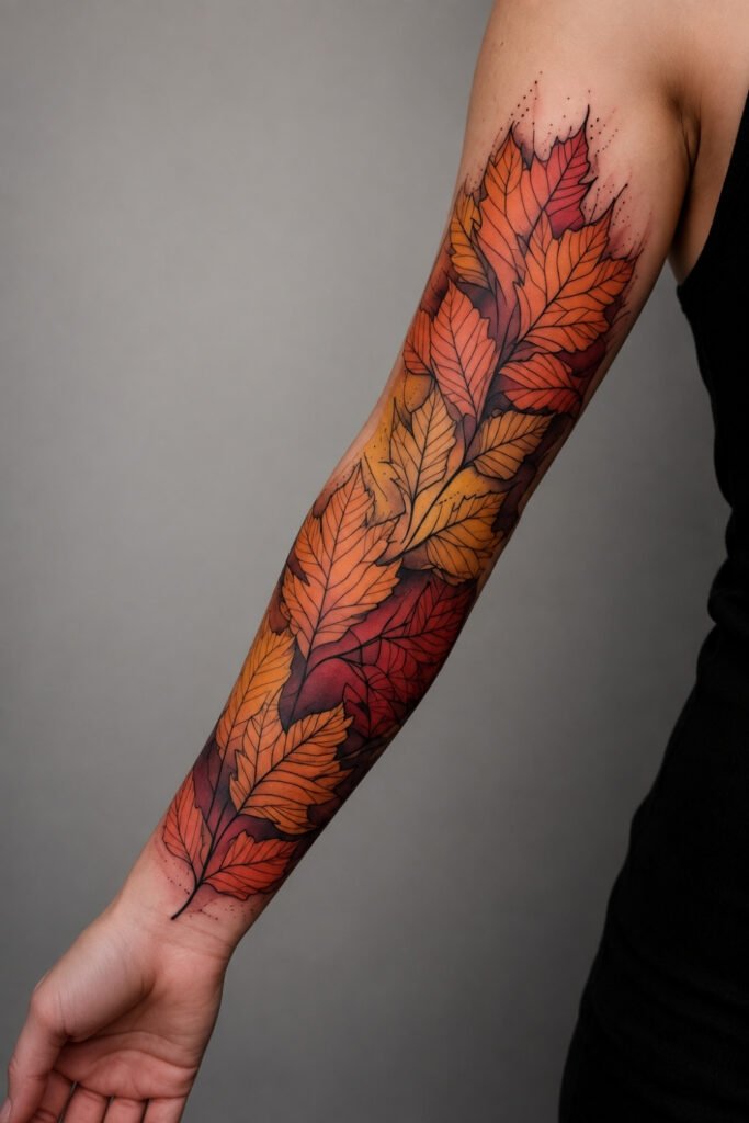
5. Falling Leaves
Oak, maple or mixed leaves in motion, scattered or following a line down the arm.
The most versatile design here. It works in fine line, blackwork or full colour, scales from tiny to full sleeve, and it flows naturally with the body.
Leaves also fill space beautifully around other work, which makes this a useful piece if you are building a sleeve rather than getting one thing.
 Save
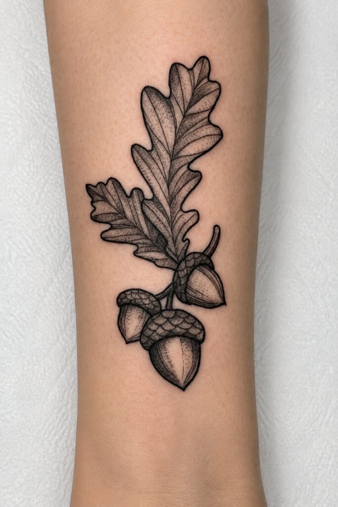
Save6. Oak and Acorn
An oak leaf with an acorn, or acorns alone.
Small, dense with meaning, and masculine in a way that does not try. Acorns carry potential and patience, oaks carry endurance, and neither needs the holiday to make sense.
Excellent at small scale, which makes it a strong choice for a first tattoo or for filling a gap.
 Save
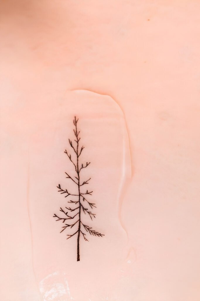
Save7. The Bare Tree
A single tree in late autumn, half-stripped or entirely bare, in silhouette or fine linework.
More sombre than the rest of the article and genuinely striking. It reads as a piece about time and cycles rather than about a holiday at all.
Works particularly well on the ribcage or the outer arm, where the vertical shape follows the body.
 Save
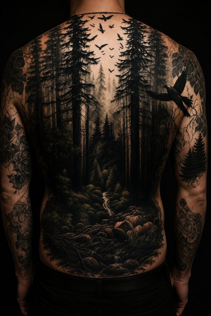
Save8. The Autumn Landscape
A full scene: fields, a treeline, a low sun, migrating birds.
The most ambitious option here and the one that needs the most space. The back is the natural home for it, or a thigh if you want it private.
This is a several-session piece. Budget and plan accordingly rather than treating it as a seasonal impulse.
 Save
SaveGratitude
9. Script
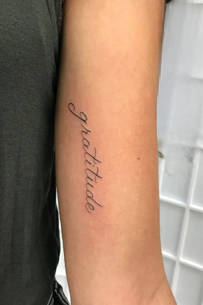
A single word: gratitude, thankful, grateful.
The most direct expression of the theme and the one most likely to still mean something in thirty years, since gratitude does not go out of season.
Placement matters more than usual with script. Inner forearm and wrist read as a reminder to yourself, which is generally the point. Get the font right and see it printed at actual size before it goes on.
 Save
Save10. A Quote or Phrase
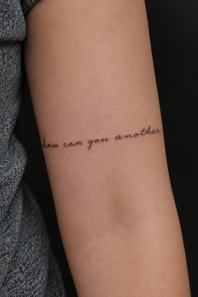
A line that means something to you, in script or lettering, often wrapped around the forearm.
Longer text follows the arm’s curve naturally, and you can scale it for the outer forearm if you want it seen or wrap it more tightly if you would rather it were private.
One practical note: fine script blurs over decades as ink spreads slightly under the skin. Slightly larger and slightly bolder than feels necessary is the right call.
 Save
Save11. Minimal Symbol
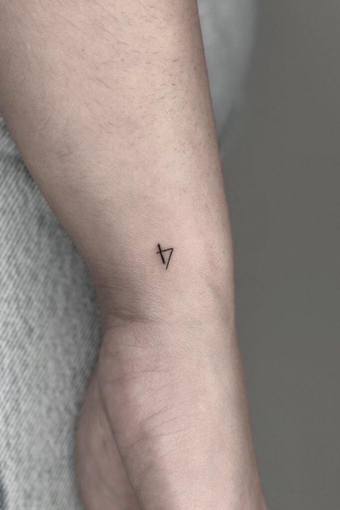
A small geometric or abstract mark standing in for gratitude, without spelling it out.
For anyone who wants the meaning without the explanation. Nobody asks about it, and you know what it is.
The most private option in the article and the easiest to place anywhere.
 Save
SaveFamily and the Table
12. The Gathering
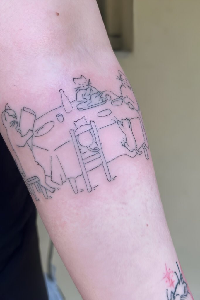
A table, a set of chairs, or hands around a meal, rendered simply.
Thanksgiving is fundamentally about people eating together, and a design about the table gets closer to that than a turkey does.
The chest or ribcage suits this, since it is the placement traditionally used for family pieces and things kept close.
 Save
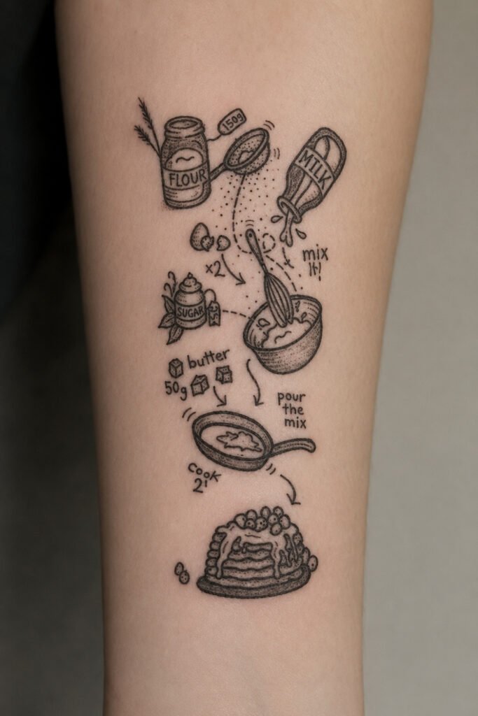
Save13. A Recipe in Handwriting
A family recipe, or a line from one, tattooed in the original handwriting of whoever wrote it.
The single most meaningful idea in this article, and increasingly common. If you have a grandmother’s recipe card, an artist can reproduce the handwriting exactly.
Bring the original. A scan or a photograph of the actual card, not a retyped version, which loses the entire point.
 Save
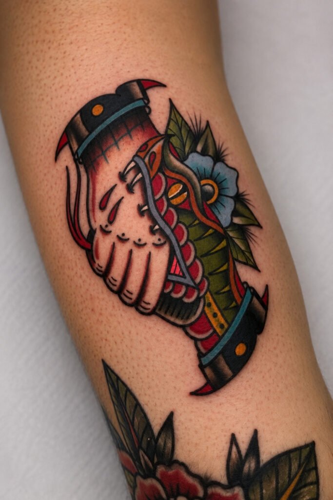
Save14. Hands
Two hands clasped, hands over a table, or a single hand holding something.
Restrained and legible, and it carries the gathering theme without needing a scene. Traditional tattooing has used hands for a very long time, so there is a deep well of reference to draw on.
Works well in American traditional style, where the bold lines suit the subject.
 Save
SaveThe Holiday Itself
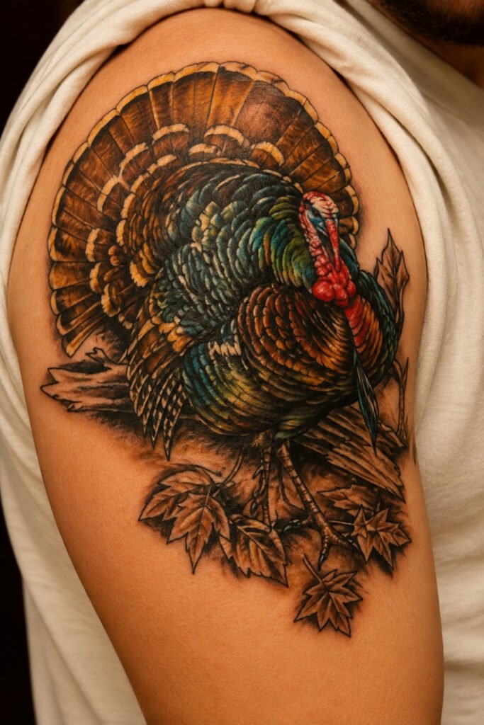
15. The Wild Turkey
A realistic wild turkey, textured feathers in warm autumn tones, sometimes with falling leaves behind.
Worth distinguishing from the dinner-table version entirely. A wild turkey is a genuinely impressive bird, and it carries meanings that have nothing to do with a plate: resilience and endurance, since turkeys are adaptable and survive in a range of environments.
Shoulder, ribcage or upper arm, where the detail has room to show. This is the version of a turkey tattoo that ages well.
 Save
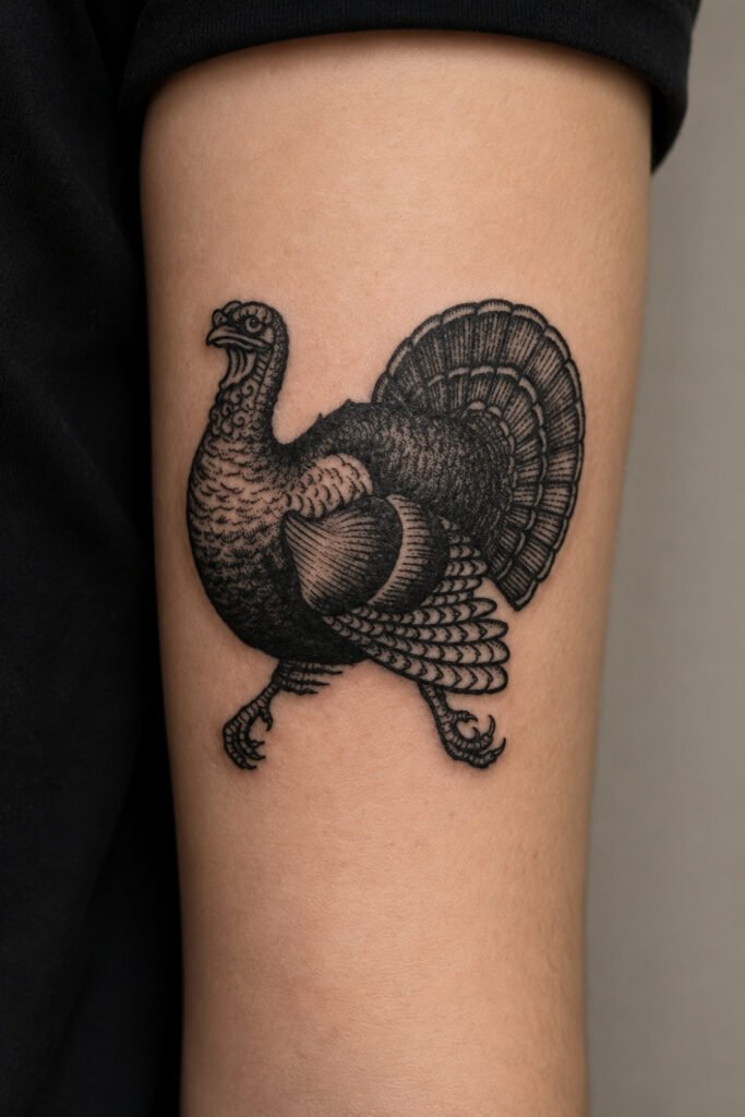
Save16. The Traditional Turkey
A turkey in American traditional style: bold outlines, limited palette, flat colour.
Traditional tattooing handles animals with a confidence that realism sometimes lacks, and a bold traditional turkey reads as a tattoo rather than as a picture of a turkey.
Blackwork versions using negative space and precise linework are also genuinely striking, and they will hold their definition considerably longer than colour.
 Save
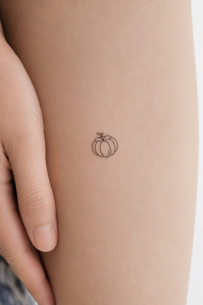
Save17. The Pumpkin
A single pumpkin, or a gourd worked into a larger piece.
Straightforward, seasonal, and honest about being so. Pumpkins carry harvest and comfort without pretending to be about anything grander.
Good small, and it pairs naturally with leaves or wheat if you decide to build around it later.
 Save
SaveColour or Black and Grey
Worth deciding early, because it affects everything else.
The Thanksgiving palette is warm: deep oranges, yellows, reds and browns. Those are the colours that make a harvest piece sing, and there is no black and grey equivalent for the specific warmth of an autumn scene.
But warm colours are also the ones that fade fastest, particularly on skin that sees sun. Oranges and yellows are the least stable pigments there are, and a bright autumn piece on a forearm will need touching up over the years in a way that a blackwork piece will not.
Black and grey holds its definition far longer and suits several designs here better than colour would. Wheat, bare trees, script and blackwork turkeys are all arguably stronger without colour.
The practical position: colour for pieces you are willing to maintain and can keep out of direct sun, black and grey for anything on a forearm or hand.
Placement
Forearm for script, quotes and wrap-around compositions that follow the arm’s curve. The most visible option and the one that takes the most sun.
Upper arm and shoulder for larger colour work: turkeys, cornucopias, still lifes. Detail has room and the skin is less exposed.
Chest and ribcage for family pieces and anything kept private. This is the traditional placement for things close to the heart, and the ribs suit vertical compositions.
Thigh and calf for detailed painterly scenes. A broad canvas, easy to cover, and considerably less sun exposure than an arm.
Back for full landscapes. The only placement with room for a complete scene.
Wrist for minimal marks and single words, with the caveat that wrists blur faster than most placements because the skin moves constantly.
Before You Book
Ask yourself the twenty-year question honestly. Not whether you will still like autumn, but whether the specific image still works when the holiday that inspired it is no longer the reason you are looking at it. The harvest and gratitude designs pass that test easily. The novelty designs are the ones to think about.
Find an artist who does the style, not one who does tattoos. A realistic wild turkey and a bold traditional turkey are different disciplines. Look at portfolios for the specific style rather than for general quality, and look at healed work rather than fresh photographs.
See it at actual size before it goes on. Particularly with script and lettering. Fonts that look right on a screen are frequently too small or too fine in practice.
Book early for late November. Good artists are booked out weeks or months ahead, and deciding in the second week of November means either a compromise or a wait.
Plan for aftercare, and for the sun. Fresh tattoos need to stay out of direct sunlight entirely while healing, and healed colour work needs sunscreen for the rest of its life if you want it to stay bright. That is a real commitment for a warm-toned autumn piece on a visible placement.
Common Questions
What is the best Thanksgiving tattoo that is not a turkey?
A cornucopia, wheat, or gratitude script. The cornucopia is the strongest symbolic image of the holiday, representing abundance and sustenance, and it predates the American celebration. Wheat is the most understated and the most durable. Gratitude script is the most direct and the least likely to date.
Is it okay to get Pilgrim or Native American imagery?
No, and tattoo publications say so directly: cartoonish Pilgrims, simplistic Native American figures and anything trivialising the colonial experience should be avoided entirely. The history is contested and the imagery is inaccurate, and appropriative Native imagery is a recognised problem in tattooing. Many artists will decline the work regardless.
Should I get it in colour or black and grey?
Colour suits harvest and autumn scenes because the warm palette is the point, but oranges and yellows fade faster than any other pigment, especially on sun-exposed placements. Black and grey holds definition far longer and genuinely suits wheat, bare trees, script and blackwork animals better. Colour on covered placements, black and grey on forearms and hands.
Where should I put it?
Forearm for script and wrap-around work, upper arm or shoulder for larger colour pieces, chest or ribcage for family tattoos and anything private, thigh or calf for detailed scenes, and back for a full landscape. Consider sun exposure alongside visibility, since it affects how the piece looks in ten years.
What is the most meaningful option?
A family recipe reproduced in the original handwriting, if you have one. It carries the gathering-and-food theme without any seasonal iconography at all, and it does not depend on the holiday to make sense. Bring the original card rather than a retyped version.
Final Thoughts
Choose the theme rather than the holiday. Harvest, autumn and gratitude all outlast the fourth Thursday in November, and they are where every genuinely good design in this category lives.
And if you want a turkey, get a wild one. It is a considerably better bird than the one on the table, and it holds up as a tattoo.