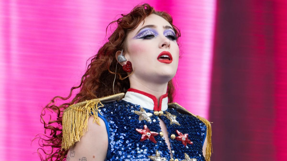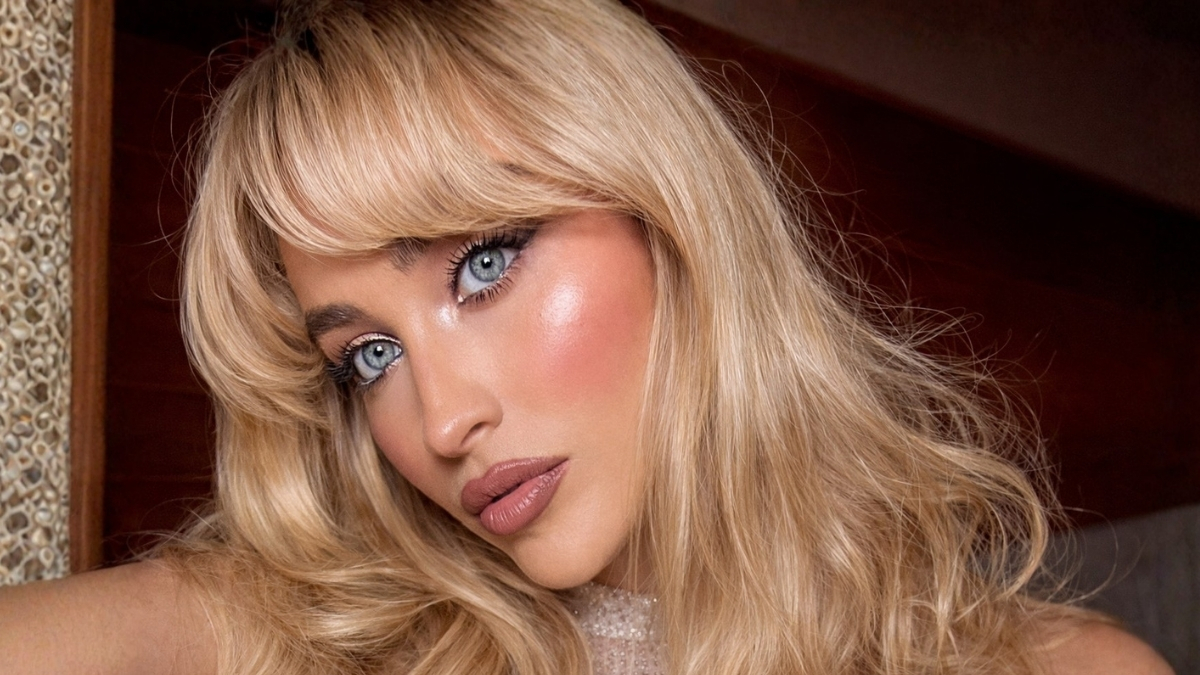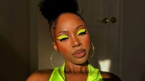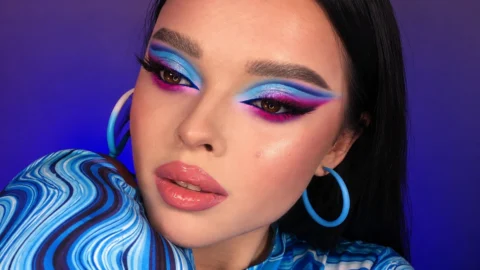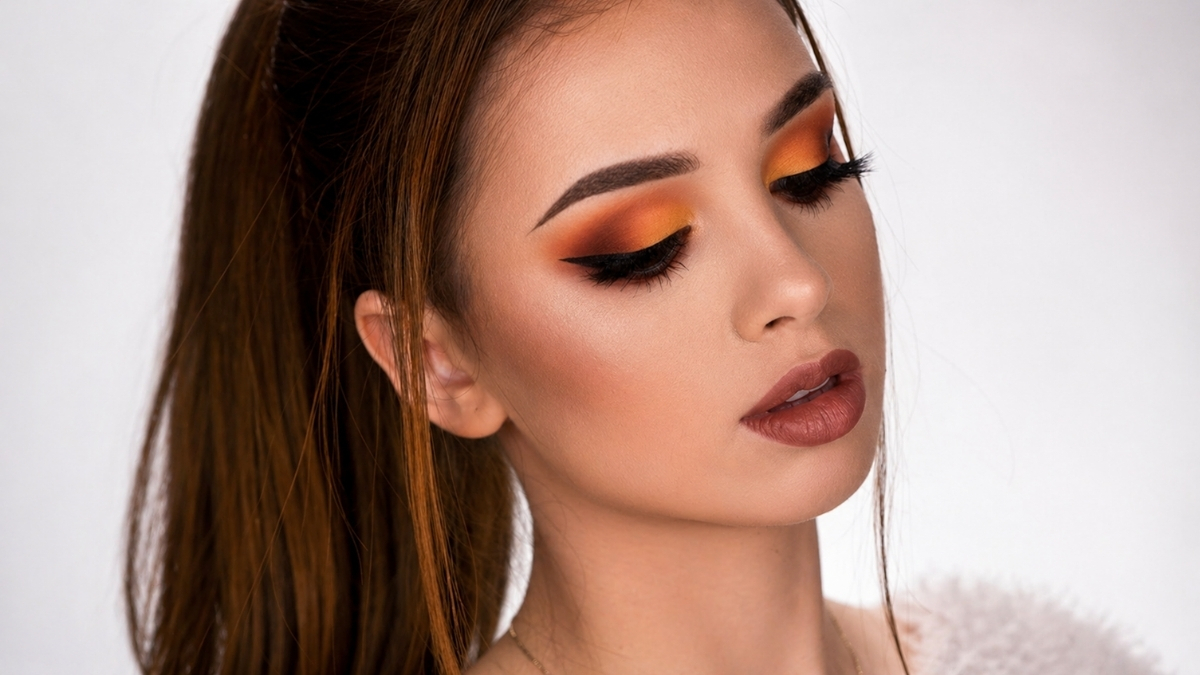
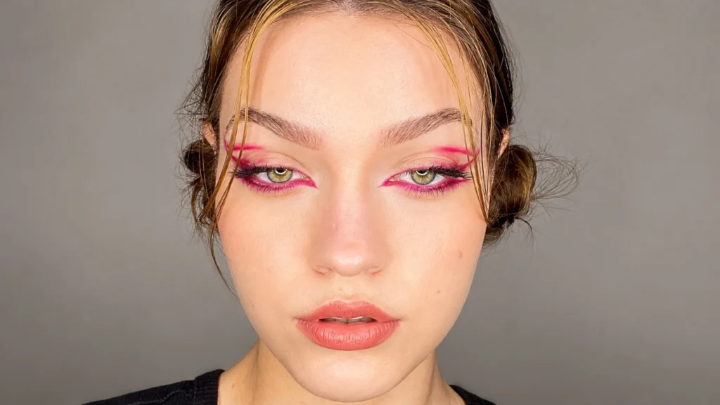
Graphic eyeliner is one of the biggest eye trends of 2026, with recent runways featuring parallel double cat-eyes, double flicks and heavy under-eye liner. The eyeliner look has moved well past the classic cat-eye flick.
MAC Cosmetics National Artist Kyle Anderson told Marie Claire in December 2025 that elevating your eye looks is as simple as playing with colourful shadows to create an eyeliner, and leaning into your own eye colour or something you are wearing to make the colours feel in sync. Make Up For Ever educator Randi Orlinsky adds that these looks are rooted in mood and storytelling, making each one completely personal and unique.
These 16 colourful graphic eyeliner looks range from the most wearable entry-point floating liner through to the full editorial geometric shapes that turn the eye into a canvas.
The 2026 Graphic Liner Principle
Most graphic liner looks follow one simple rule: if the liner is graphic, the lip is bare and balmy. One focal feature. Diffused finishes everywhere else.
Makeup consultant Delina Medhin, who has worked with Issa Rae and Phoebe Robinson, told BuzzFeed in March 2026 that the era of graphic colour does not have to be intense. Adding a blue liner smudged out is enough. People are craving fun, and colour can be done in a way that does not overwhelm the face.
The modern approach to graphic liner emphasises clean lines and thoughtful placement rather than overly complicated designs. Sketch the shape lightly before committing with full pigment. A felt-tip or fine-tip liquid liner gives the most control for any graphic design.
Floating and Crease Liner Looks
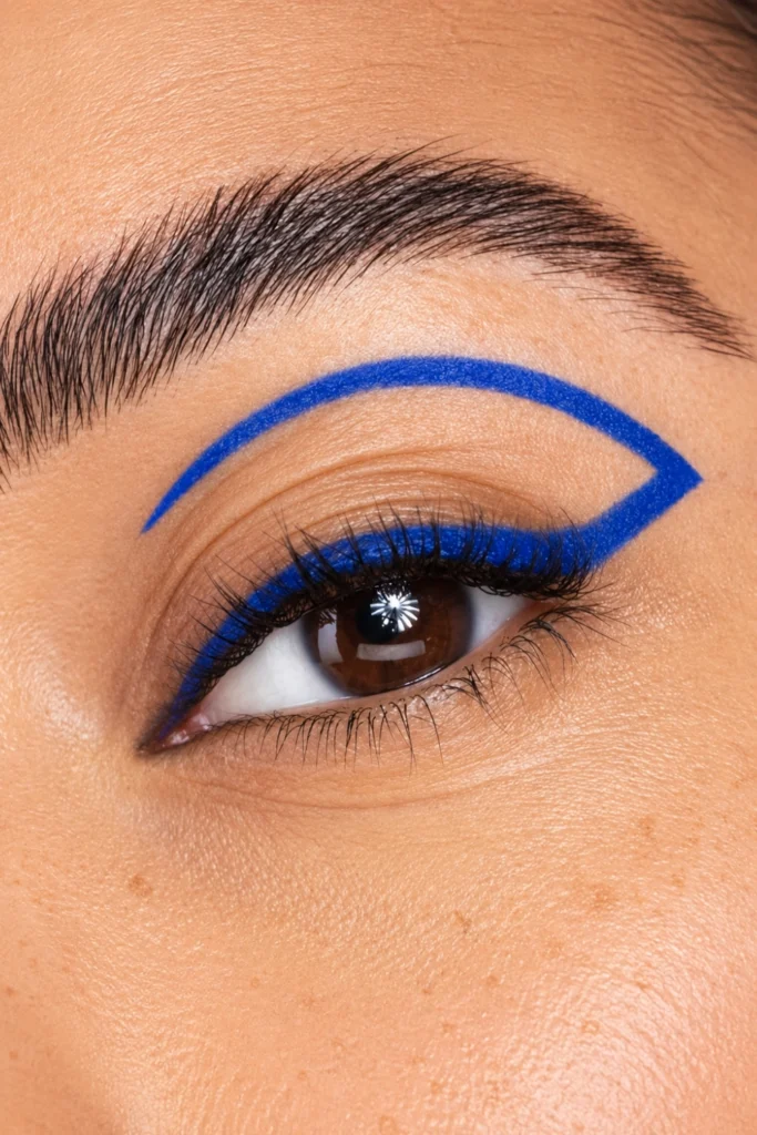
1. Floating Line Above the Crease in Cobalt Blue
A thin, clean line of cobalt blue drawn just above the crease, following the natural arc of the eye without touching the lash line. The lid below stays bare or lightly tinted. It’s the most wearable way to start with graphic liner.
Sketch the floating line in the crease with a light hand first to establish the arc before drawing with full pigment. The line should follow your natural crease shape rather than an imposed geometric shape for the most flattering placement. Press the felt-tip to the skin at one point of the line and draw in one stroke toward the other end. Multiple short strokes produce a jagged edge that a single confident stroke avoids.
A bare lid below the floating blue line is the version that photographs most clearly as a distinct graphic choice. Shadow beneath the floating line reduces the negative space that makes the look distinctive.
 Save
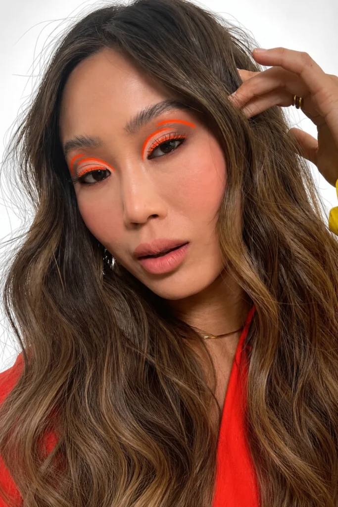
2. Floating Coral or Warm Orange Line
A thin floating line in a warm coral or orange above the crease on a bare lid. The warm tone of the floating line photographs with more softness than a cool-toned line at the same placement, making this the most wearable coloured floating liner for everyday use.
Kyle Anderson’s advice applies directly: lean into something you are wearing. A coral floating liner above the crease on a bare lid, beside a coral or warm-toned outfit, produces the cohesion that makes the colour feel intentional rather than random. The floating line should be thin enough that it reads as a line rather than a shape. Two to three millimetres maximum width.
 Save
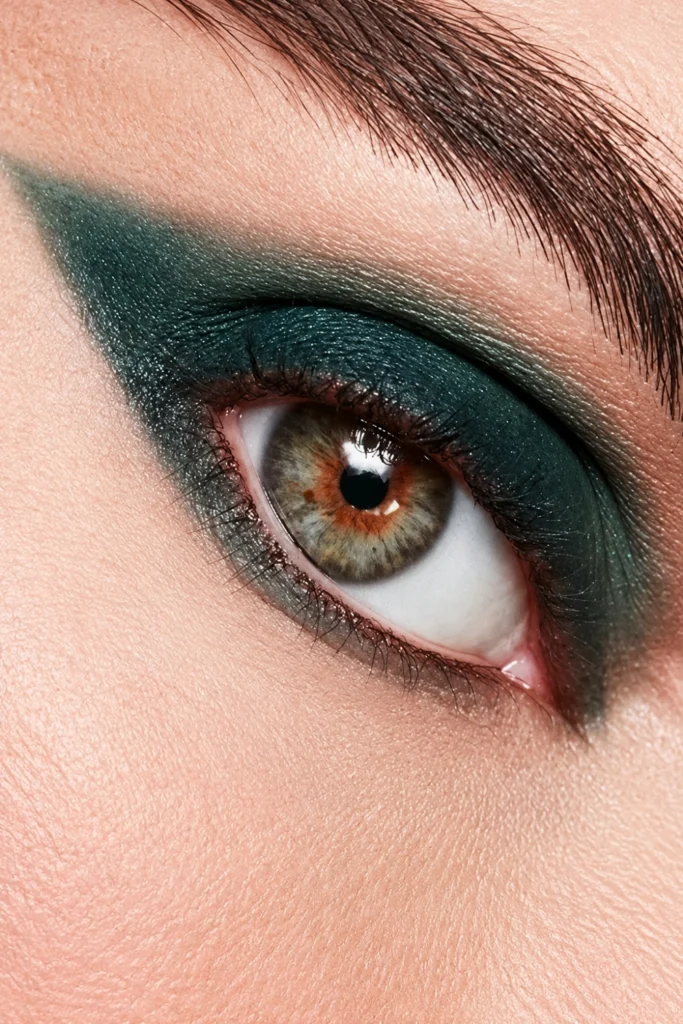
3. Forest Green Floating Liner with Smudged Edge
A forest green liner drawn above the crease and then smudged upward with a clean brush or fingertip before it fully dries, the edge blurred so the floating line reads as a soft haze rather than a sharp mark. Delina Medhin’s smudged liner approach applied to a floating crease position.
Draw the line first with a felt-tip or pencil liner. Within thirty seconds of application, before the formula sets, pull a small clean blending brush or the side of a fingertip upward through the top edge of the line. The bottom edge against the bare lid stays clean and defined. The top edge blurs into the skin. The contrast between the clean bottom edge and the diffused top produces the smudged graphic effect Delina Medhin named as the approachable 2026 liner direction.
 Save
Wing and Extended Liner Looks
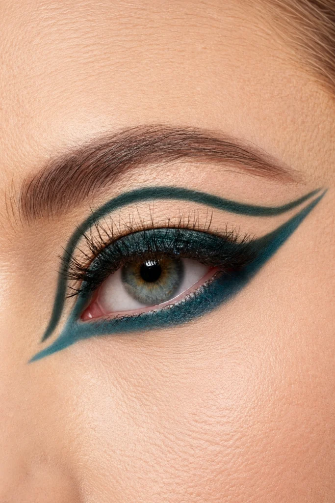
4. Double-Winged Liner in Deep Teal
Two parallel lines extending from the outer corner of the upper lash line in a deep teal or jewel-toned blue-green, the lines drawn close together and slightly diverging toward the outer tip. Parallel double cat-eyes have been a recent runway favourite.
Draw the lower line first following the standard cat-eye flick direction. Draw the second line two to three millimetres above the first, parallel and slightly thinner. The two lines should not touch. The gap between them is the negative space that makes the double-wing distinct from a single thick wing. Teal or jewel-toned blue-green reads with the most visual depth of any colour at this placement.
 Save
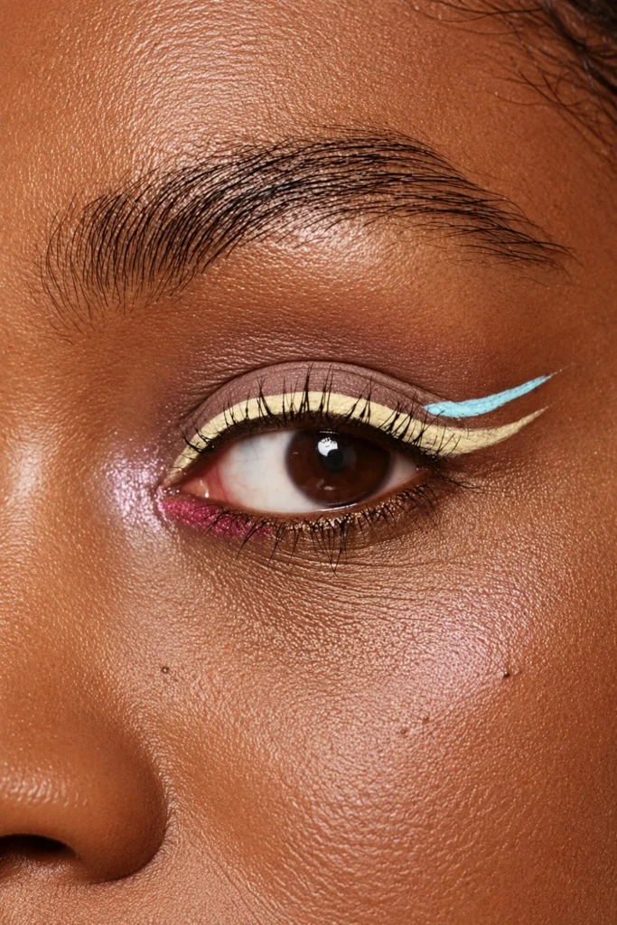
5. Double Wings in Contrasting Colours
Two parallel wings from the outer corner, the lower wing in a deep or dark tone and the upper wing in a vivid contrasting colour. The contrasting colour version extends this approach.
Draw the first wing in black or a dark navy. Once set, draw the second wing in a bright coral, vivid green, or electric blue two to three millimetres above it. The dark lower wing anchors the look and the vivid upper wing delivers the colour statement. The two wings going in the same direction rather than divergent directions reads as more composed and less conceptual for everyday wear.
For more bold liner ideas, see our festive eyeliner looks.
 Save
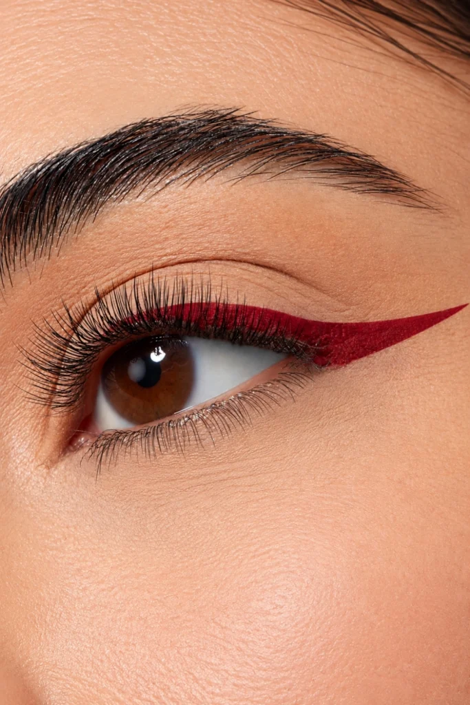
6. Extended Outer Corner in Vivid Red
A standard thin upper lash line in black or dark brown with the outer corner extended further than a standard wing and drawn in vivid red rather than continuing the dark line, the red extension reading as a separate colour accent from the neutral liner base.
Draw the black lash-line liner first from inner to outer corner. At the outer corner, switch to the red liner and extend the line further outward and upward in the standard wing direction. The colour switch at the outer corner occurs at the point where the black liner would normally end. The red continuation photographs as a deliberate design decision rather than a liner accident.
 Save
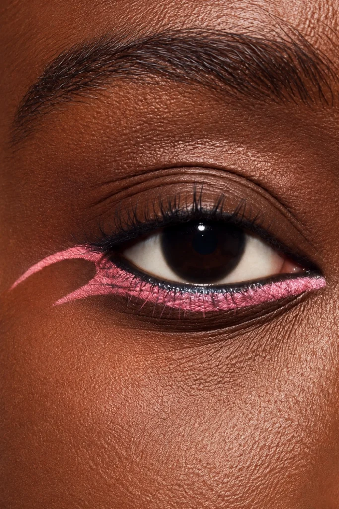
7. Straight Lower Liner in Electric Pink
A straight line of electric pink liner along the lower lash line only, the line running flat from inner to outer corner without flicking upward at the outer corner. The upper lash line stays bare or gets only mascara.
A straight lower liner in a vivid colour is the graphic liner look most people have not tried and most quickly notice on others. The lower lash line is the least liner-saturated placement in mainstream beauty. A flat, vivid pink line along the full lower lash line with a bare upper lid photographs with a clarity and directness that upper lash-line graphic liner cannot produce because the upper lid is already the expected location for liner.
 Save
Geometric and Shape-Based Liner Looks
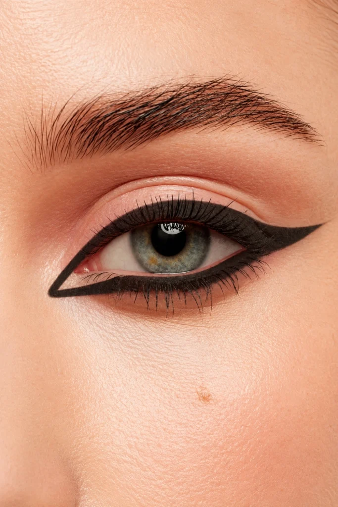
8. Triangle Extension at the Outer Corner
A filled triangle of colour extending from the outer corner of the upper lash line, the triangle pointing outward rather than upward, the solid shape replacing the standard angled wing.
Sketch the triangle shape in pencil on the skin outside the eye before drawing with liner. The three points are: the outer corner of the upper lash line, a point extending further outward at lash level, and a point above that at the level where the crease ends. Fill the triangle with a flat brush and a gel liner in a vivid colour, then define the edges with a felt-tip liner. The filled shape is always more graphic than a line outline alone.
 Save
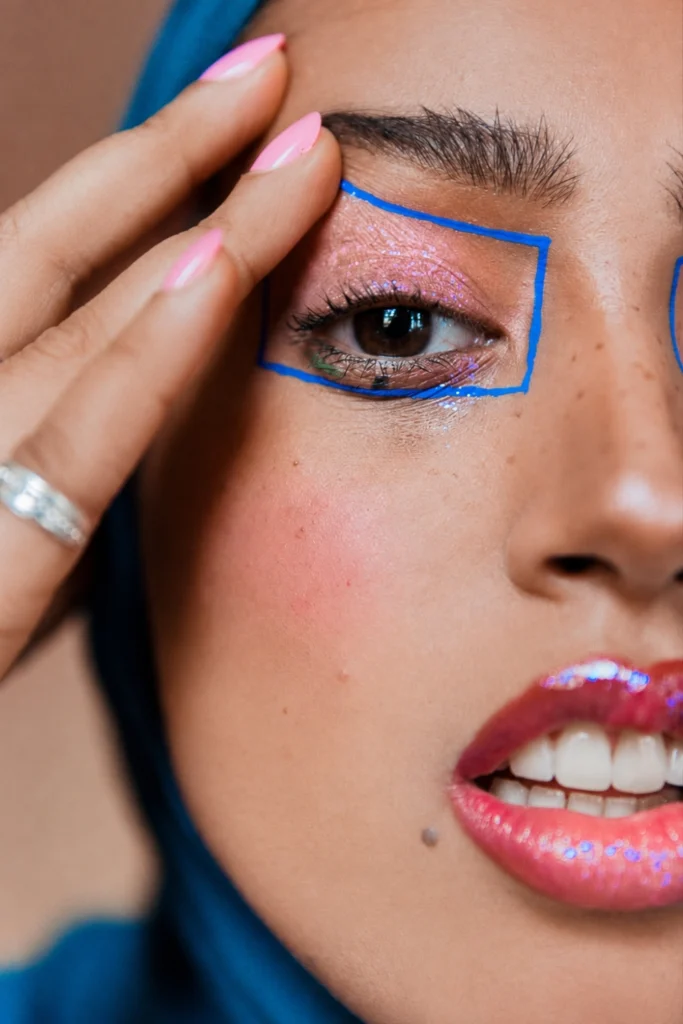
9. Colour Block Rectangle at the Lid Centre
A rectangular block of vivid colour applied to the centre of the lid only, the block sitting from lash line to crease level in the middle third of the eye, the inner and outer thirds of the lid left bare.
The rectangular colour block works best in a vivid, saturated colour, deep purple, cobalt blue, or electric green, because the shape depends on the colour standing distinct from the surrounding skin. Apply with a flat shader brush using a pressing rather than sweeping motion. Clean the edges of the rectangle with a cotton bud loaded with micellar water while the liner is still slightly wet. Sharp corners are what distinguish this from a standard lid shadow.
 Save
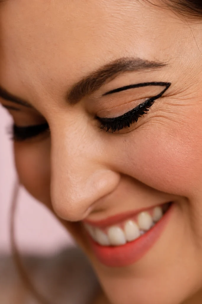
10. Negative Space Wing
A standard black winged liner with a gap deliberately left between the liner and the lash line, the negative space of bare skin creating the impression of a floating line without requiring the liner to actually float above the crease.
Draw the wing and the outer third of the upper lash liner, then jump inward to draw the inner two-thirds of the upper lash liner, leaving a two to three millimetre gap in the lash line between the inner section and the wing. The gap of bare skin reads as negative space at the outer corner. Fill the gap with a vivid colour, electric blue, bright yellow, or coral, for the colourful negative space version that photographs with a layered graphic quality.
 Save
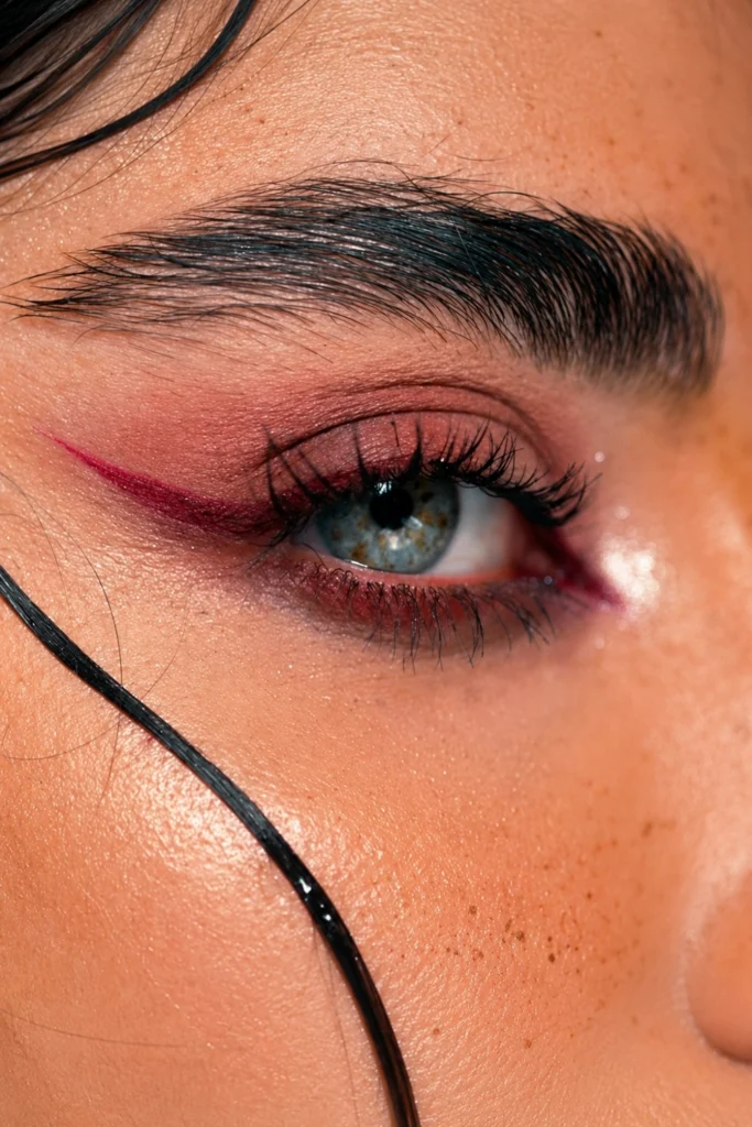
11. Reverse Liner on the Lower Lash Line Only
A vivid coloured liner applied only to the lower lash line from inner to outer corner with no upper liner and no shadow, for an edgy look that stands out from traditional liner.
Heavy under-eye liner has been a recent runway trend. The coloured reverse liner version uses a vivid or jewel-toned shade rather than black. Keep the upper lid completely bare for maximum impact. A bare upper lid beside a strongly defined lower line photographs with a deliberately inverted quality that is immediately memorable.
 Save
Smudged and Textured Colourful Liner Looks
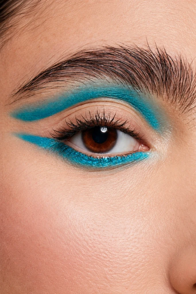
12. Smudged Teal or Turquoise Under-Eye
A teal or turquoise liner pencil applied to the lower lash line and immediately smudged downward and outward with a small brush, the colour dispersing below the lash line in a soft, blurred shadow rather than sitting as a hard line.
This smudged look feels relaxed and moody: the colour appears to have arrived rather than been placed. Apply the liner and smudge within thirty seconds before the formula sets. The further the smudge extends below the lash line the more editorial the result. At two millimetres below the lash line it reads as a day look. At five millimetres it reads as an evening statement.
 Save
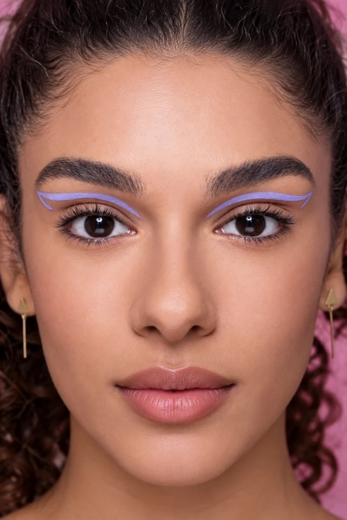
13. Watercolour Liner Wash in Lilac
A lilac or pale purple liner pencil applied to the upper lash line and then blurred and softened immediately with a damp brush or fingertip so the line reads as a watercolour wash rather than a sharp edge. The coloured liner used as both liner and shadow simultaneously.
Load a small flat brush with water and press it along the applied liner while still wet. The water dilutes the pigment and spreads it slightly upward and outward in an uneven, watercolour-like pattern. The original liner at the lash root stays the most concentrated. The spread above it becomes progressively lighter. A single lilac liner pencil produces both the defined lash-line element and the diffused shadow element in one step.
 Save
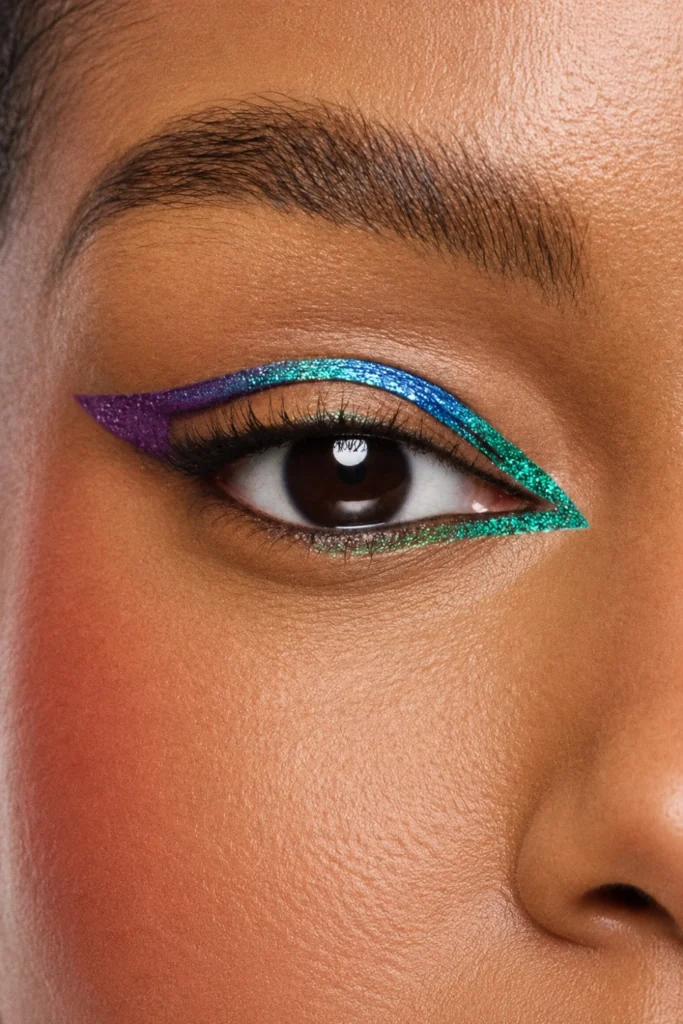
14. Metallic Inner Corner Pop with Coloured Wing
A vivid coloured wing at the outer corner in a deep jewel tone, with a reflective metallic or chrome liner pressed only at the inner corner as the contrasting accent. Kyle Anderson suggests using reflective textures at the inner corner and brow as a highlight is one of the simplest ways to elevate a colourful eye look.
The metallic inner corner beside a coloured wing is the graphic liner combination that photographs with the most dimensional quality because the two elements are doing different visual work. The coloured wing extends and elongates. The metallic inner corner brightens and opens. They complement rather than compete because they sit at opposite ends of the eye.
 Save
Advanced Colourful Graphic Liner Looks
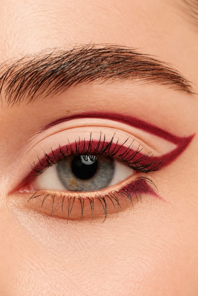
15. Monochrome Liner and Shadow in Warm Berry
A warm berry or plum liner applied to the upper lash line and smudged into a matching berry shadow across the lid simultaneously, the liner and the shadow merged into a single monochrome colour statement.
Apply the berry liner first along the upper lash line. Before it dries, press a matching berry eyeshadow over the liner and the surrounding lid with a flat brush. The liner and the shadow blend at their contact point and produce a surface where the liner defines the edge and the shadow fills the lid in the same tone. The result is more dimensional than a liner alone and more precisely edged than a shadow alone.
For a fresh base that keeps liner looking crisp, see our beauty tips.
 Save
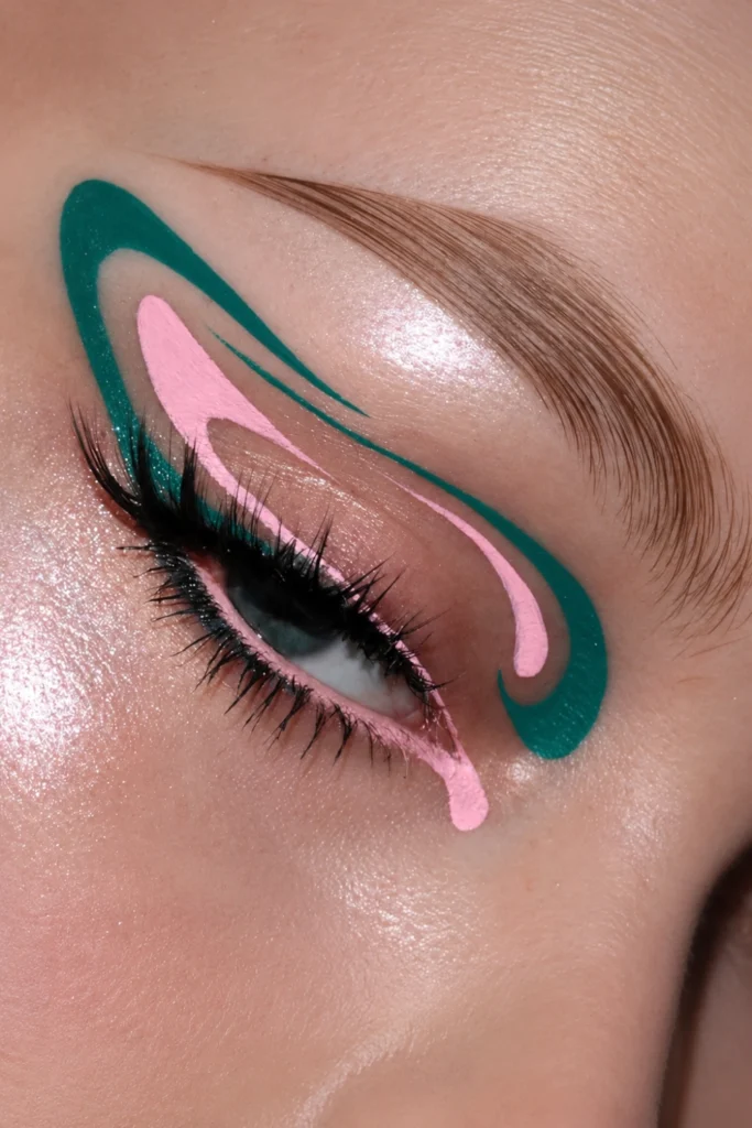
16. Abstract Colour Shape Above the Crease
A completely freehand abstract shape in a vivid colour placed above the crease, the shape not referencing any standard liner position, a circle, a curve, an angular form, or a paint-stroke inspired mark applied wherever the composition feels right for the eye shape.
Randi Orlinsky names these looks as rooted in mood and storytelling, each one completely personal and unique. The abstract crease shape is the most artistic and least technically replicable look on this list precisely because it has no fixed rules. Choose a vivid colour that complements the eye or the outfit. Choose a shape that feels interesting rather than familiar. Apply it with a gel liner and a fine brush, clean any unintended edges with a cotton bud and micellar water, and leave the final result as is.
 Save
Tools for Graphic Eyeliner
A fine-tip felt-tip liquid liner is the tool for clean graphic lines, wing shapes, and any design that requires a precise edge. The felt tip glides without pressing too hard and deposits a consistent line width. For straight geometric lines where consistency matters most, brace the elbow against a surface and draw in one confident stroke.
A gel liner in a pot with a thin angled brush gives more control for filling shapes, drawing thick lines, and any design where both precision and coverage are required. The gel formula allows a brief window for correction before it sets. A fine liner pencil gives the most blendable result for smudged and watercolour liner effects because the formula stays workable longer than a liquid or gel.
A cotton bud loaded with micellar water is the graphic liner tool that most people overlook. Every clean edge on a geometric or floating liner shape is cleaned after application rather than drawn perfectly in the first pass. Draw close to the intended shape and clean to the final edge. That two-step approach produces a sharper result than attempting perfection in the initial application.
Frequently Asked Questions
What is colourful graphic eyeliner?
Colourful graphic eyeliner is any bold or artistic liner application using a non-black or coloured formula in a placement that goes beyond the standard lash line or cat-eye wing. Popular graphic liner styles include floating liner above the crease, double-winged designs, extended outer corners, negative-space shapes, and geometric forms. MAC Cosmetics National Artist Kyle Anderson names coloured shadows used to create an eyeliner effect as the simplest version of the colourful graphic liner approach.
What are the most popular graphic eyeliner looks for 2026?
Floating liner above the crease, parallel double wings, extended outer corners, triangular extensions, colour-block shapes and coloured lower-lash liner are among the most popular graphic liner looks. Floating liner is the easiest place for beginners to start.
What colours work best for graphic eyeliner?
Makeup consultant Makeup consultant Delina Medhin told BuzzFeed that a smudged blue liner is an easy, fun way to wear colour. Kyle Anderson recommends leaning into your own eye colour or something you are wearing to make the colours feel in sync. Cobalt blue and teal photograph with the most depth at graphic liner placements. Coral and warm orange are the most universally flattering coloured liner shades for the widest range of skin tones. Vivid red reads as the most editorial and statement-forward at any graphic placement.
How do you apply graphic eyeliner without it looking messy?
Sketch the shape lightly first before committing with full pigment. Use a fine-tip felt-tip liquid liner for any design requiring a precise edge. Brace the elbow against a surface and draw in a single confident stroke rather than multiple short strokes. Clean every edge after application with a cotton bud loaded with micellar water. The clean edge is applied after the liner, not drawn perfectly in the initial pass. Focus on clean lines and thoughtful placement rather than complexity.
Can graphic eyeliner work for everyday wear?
Yes. Delina Medhin told BuzzFeed March 2026 that colour can be done in a way where it does not have to be so intense. A blue liner smudged out, a straight lower lash liner in a vivid colour on a bare upper lid, or a floating thin line above the crease in a warm tone are all wearable graphic liner options for everyday contexts. Floating liner adds drama without needing a perfect wing.
Final Thoughts
Colourful graphic eyeliner in 2026 is built on the principle Kyle Anderson named directly: it is as simple as playing with colourful shadows and liners to create something personal. The floating crease line is the starting point. The double wing is the next step. The abstract crease shape above it is where it becomes genuinely your own.
Start with the floating cobalt blue line above the crease if graphic liner is new territory. Move to the straight lower liner in electric pink when you want something that requires less technical precision. The cotton bud and micellar water clean-up step is what separates every sharp graphic liner look from every one that did not land as intended.