The Pantone Colour Institute has traditionally analyzed the shades of outfits that designers showed at New York Fashion Week. The experts have determined the relevant tones for the upcoming autumn-winter season.
In this article, a writer from a free essay writer service tells things about what color to replenish your wardrobe to be in trend.
Base colours of autumn-winter 2023-2024
1) Coconut milk
It’s a milky white shade, and Pantone alone knows what coconut has to do with it. However, it’s a spectacular color for the autumn/winter season, as few people venture into lighter shades at this time of year.
Warm white looks harmonious with other warm colors. But warm and cold white in one ensemble should be combined with caution. The first against the background of the second runs the risk of looking sloppy and washed out.
2) Eclipse
This shade is so dark it’s almost black. However, even the not-so-sighted eye will recognize the blue in it. It’s an excellent option for those who think black doesn’t suit them. Dark blue can look less contrasting and, at the expense of this, look better.
3) Silver Birch
The light grey color looks almost shiny due to the shade rather than the dots. It’s very dressy and will look particularly good in pieces made from smooth, slippery fabrics such as satin.
4) Doe
A light brown shade that, according to Pantone, radiates warmth. It’s just what you need for chilly weekdays.
For the previous four seasons, Pantone offered bright, almost pure shades of red, yellow, orange, etc. In the current palette, there are also saturated colors, but slightly more muted or, on the contrary, whitened.
5) Delicate peach
This warm shade of peach is in the accent colors, although it could easily be added to the list of primary colors. It will go well with the rest of the on-trend colors.
6) Pink-Purple
Fuchsia with a reddish tinge. A bright color that will help to brighten up grey everyday life. Goes well with both neutral and other bright colors.
7) Viva Magenta
Crimson with a blue undertone is Pantone’s top color of 2023. So, if you buy something in this shade in advance, you can keep wearing it and feel on trend.
8) Red-orange
It’s a bright, warming shade. If wearing a large piece in this color is too bold, try using it in accessories.
9) Red Dahlia
A deep, elegant shade of red closer to burgundy. Suitable for understated wardrobes that don’t have room for bright colors.
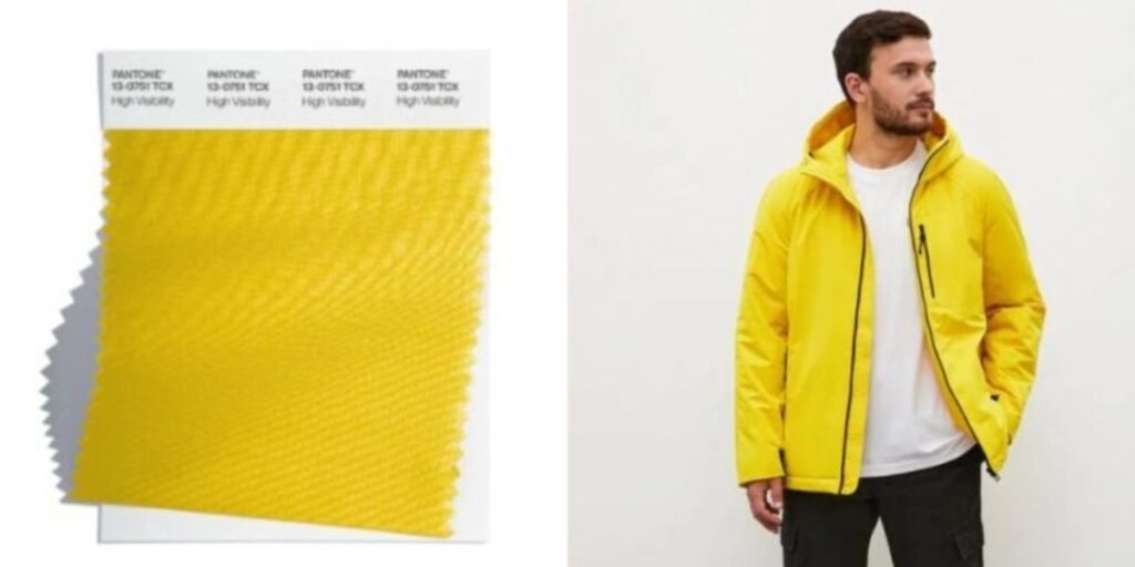
10) High visibility
The yellow we were encouraged to wear in spring and summer was closer to neon. The current shade is no longer neon but as dazzlingly bright as the sun.
11) Persian jewel
A blue color inspired by the hue of the lapis lazuli stone. This tone is arguably the coolest of the entire palette, which is something to consider when considering an outfit.
12) Carnival Glass
It is a menthol color that is spectacular and goes well with its neighbors in Pantone’s seasonal palette. For example, it will make a successful mash-up with ‘Persian Jewel’ or yellow.
13) Burnt Sienna
Complex salmon color with touches of peach and carrot. Because it’s found in nature, it’s easy to combine with similarly natural shades.
14) Kohlrabi
If almost neon colors aren’t enough for some, Pantone’s recommendations include this vibrant green. If it seems random, imagine a combination of Kohlrabi, Burnt Sienna, and Persian Jewel, and everything will fall into place at once. This color in the palette is just what you need for more daring outfits.


