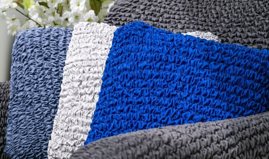
In the dynamic world of interior design, color serves as a silent storyteller, influencing the atmosphere and mood of our living spaces. Get ready to cocoon your walls in earthy tones, adorn furnishings with vibrant arm chair covers, and set an inviting ambiance with carefully chosen lighting. This exploration takes a closer look at where ancient wisdom merges with modern practices. Join us in the fascinating interplay between color and emotion within our living spaces.
Color Therapy Through the Ages: Ancient Wisdom and Modern Practices
The therapeutic use of colors is an alternative healing practice that dates back to ancient civilizations. The concept revolves around the idea that colors can have a profound impact on an individual’s physical, mental, and emotional well-being.
While color therapy is not universally accepted within the medical community, some proponents believe that exposure to certain colors can affect the body’s energy centers or chakras and promote healing. Here’s a brief overview of how colors have been historically used to treat health issues:
- Ancient Egyptian and Chinese cultures used colors for healing. Egyptians utilized colored sun gels to focus sunlight on specific body areas, while the Chinese employed colored stones and crystals.
- Modern color therapy often involves exposure to colored light through lamps, filters, or visualizations. Advocates argue that different colors have unique vibrations impacting the body’s energy system.
- In the field of mental health treatment, shades are explored for their impact on mood and emotions. Mental health settings may use specific colors to create a calming and supportive environment.
- Art therapists incorporate color into practices, allowing individuals to express emotions and explore psychological issues through art.
Expert Insights on Emerging Trends for Home Interiors
To further expand our understanding, we reached out to leading design analysts who provided expert commentary on the implications of these emerging color trends. Their insights offer a nuanced understanding of how certain colors can impact our emotions, influence our daily lives, and enhance the overall well-being of our living spaces. According to their forecast, here are the key colors that will be fashionable in 2024:
Tranquil Blues
Serene blues are expected to dominate home interiors in the coming year. Design analysts attribute the popularity of blues to their calming and serene qualities, making them ideal for bedrooms and relaxation areas. Moreover, recent studies in color psychology have shown that the shade of blue most preferred by individuals for their bedrooms is a soft, muted blue with undertones of gray. This particular shade promotes better sleep quality, making it a practical and aesthetically pleasing choice for those looking to create a tranquil bedroom retreat.
Energizing Reds and Yellows
These vibrant hues are predicted to find their way into living spaces, infusing them with warmth and vitality. In addition to being visually striking, reds and yellows have been linked to increased sociability and energy levels. Design analysts suggest incorporating these colors in communal areas such as the living room or kitchen to create an inviting and lively atmosphere, perfect for gatherings and socializing with family and friends.
Harmonious Greens
This hue is associated with nature and balance. Experts suggest that incorporating green tones can create a harmonious environment, fostering a connection with the natural world. In the bathroom, harmonious greens not only contribute to an appealing visual aesthetic but also evoke a sense of well-being by invoking the soothing attributes found in nature.
Neutral Elegance
Earthy tones and neutrals continue to maintain their popularity. Neutral colors serve as a canvas for personal expression, allowing homeowners to experiment with different textures, patterns, and accent colors. In addition, interior designers emphasize that natural shades evoke a sense of timeless elegance and adaptability in interior spaces.
Baker-Miller Pink in Design
Baker-Miller Pink, or “Drunk Tank Pink,” gained fame for its supposed calming properties. Its origins lie in its use in U.S. naval correctional facilities in the early 1980s, specifically painted on holding cell walls. Researchers Alexander Schauss and John Ott proposed the idea that this pink shade could soothe aggression, leading to reduced stress and disruptive behavior.
Despite mixed research findings, it remains a captivating example of color’s potential impact on human emotions and behavior, sparking discussions at the intersection of psychology and design. Due to its potential impact on mood, Baker-Miller Pink should be used thoughtfully to achieve the desired effect in specific home areas. Here are seven ideas on how to use this unique shade widely:
- Accent Wall. Apply Baker-Miller Pink to one wall in a room to create a focal point. This can add a subtle touch of color without overwhelming the entire space.
- Furniture and Decor. Introduce the color through furniture, throw pillows, or decor items. These accents can be easily swapped out if you decide to change the color scheme later.
- Artwork. Select artwork or prints that feature Baker-Miller Pink. This allows you to incorporate the color into your design scheme while maintaining flexibility.
- Soft Furnishings. Use pink in soft furnishings like curtains, rugs, or bed linens. These elements can infuse color into the room without being too dominant.
- Lighting. Experiment with lighting fixtures that cast a subtle pink glow. This can contribute to a warm and inviting atmosphere.
- Small Spaces. Consider using the color in smaller spaces like powder or lumber rooms. The confined area allows for a more concentrated impact without overpowering larger rooms.
- Outdoor Spaces. Extend the use of Baker-Miller Pink to outdoor areas, such as a patio or garden furniture. This can create a serene and inviting outdoor environment.
In closing, the influence of colors is profound and should not be underestimated. Whether aiming for tranquility with blues, energy with yellows or reds, harmony with greens, or the charm of pink, expert insights guide thoughtful color choices aligned with your lifestyle and preferences. Embrace the vibrant spectrum of possibilities and let your chosen colors reflect the essence of your unique style and taste.


